Dizajn pisma Kabum
Typeface design Kabum
Kabum je pismo nastalo procesom digitalizacije rukopisa.
Kabum is sa typeface designed by digitising and messily manipulating handwriting.
Kabum is sa typeface designed by digitising and messily manipulating handwriting.
2022
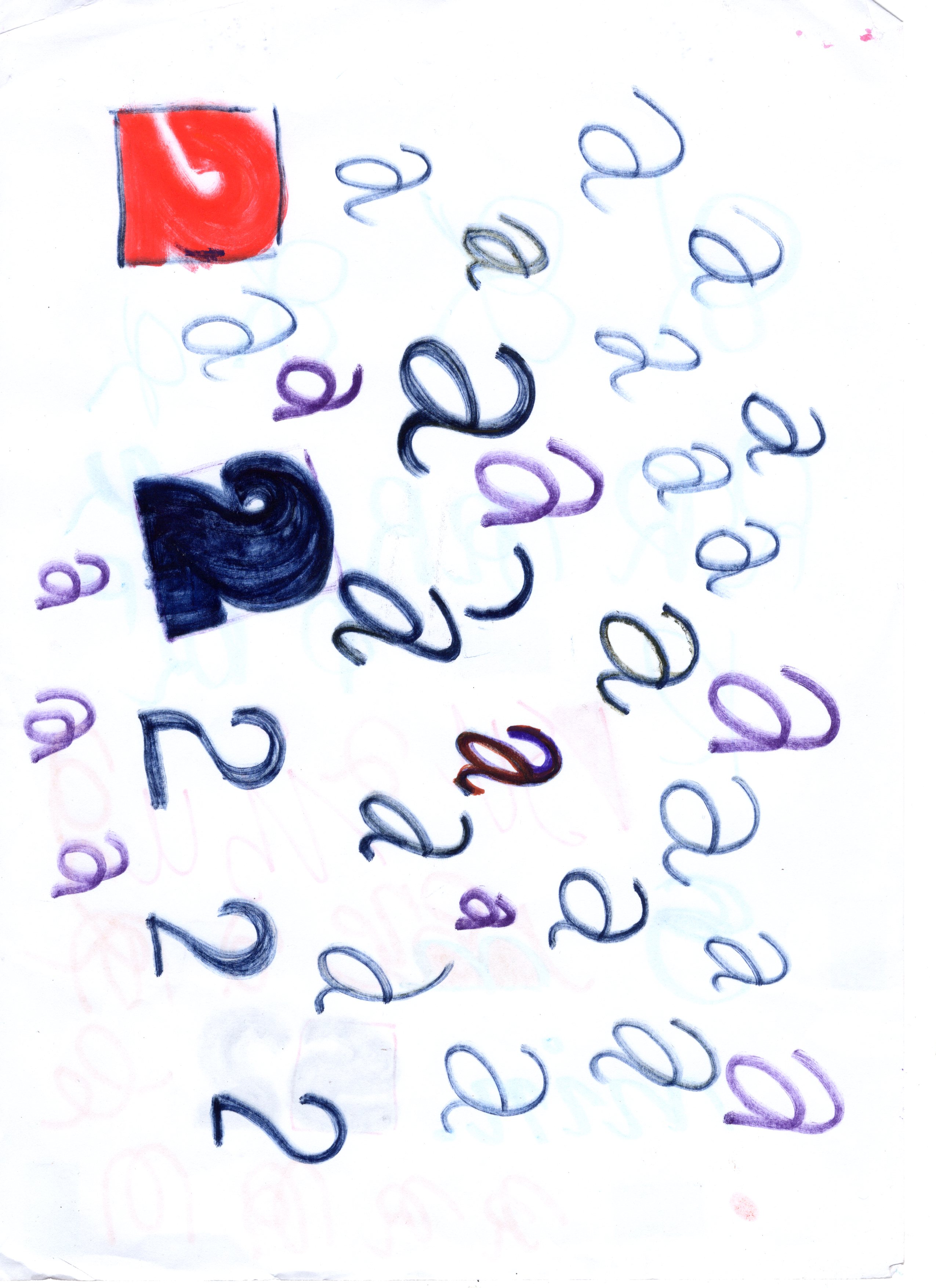
The design of the Kabum typeface began with expressive monoline handwriting, where each letterform was initially defined by uniform, single-width strokes. This captured the raw, spontaneous energy of the handwriting, but the expressiveness remained confined to the monoline structure.
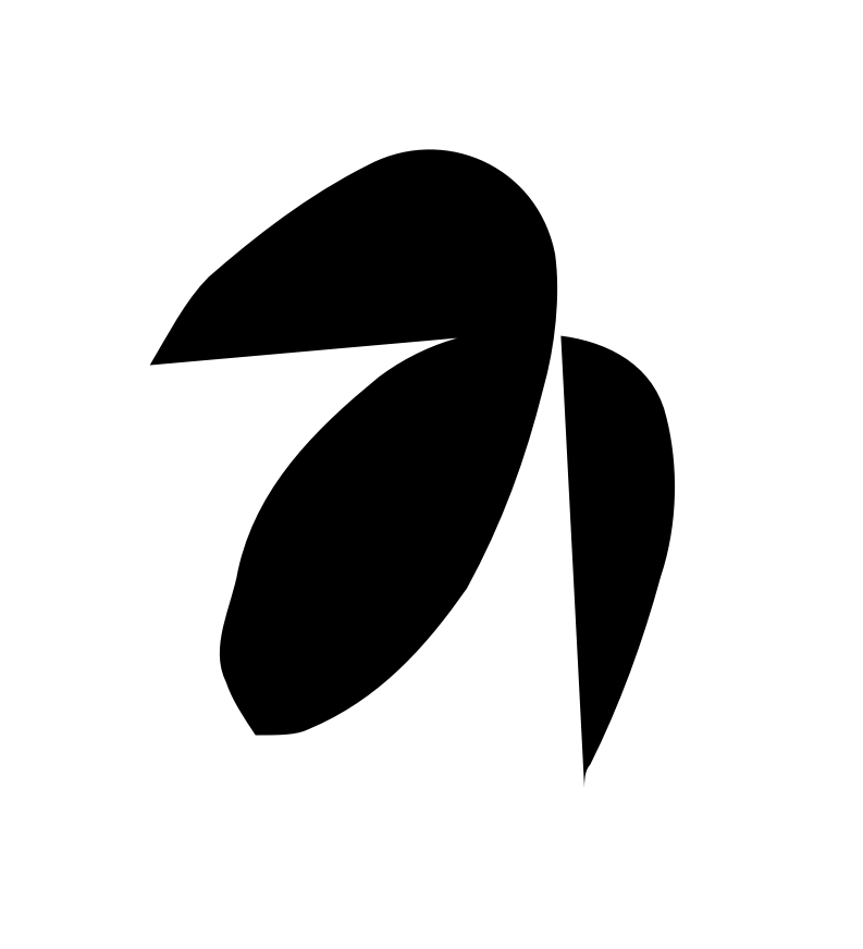
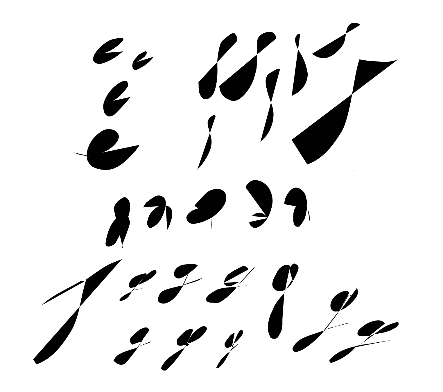
Once the handwritten forms were digitized and vectorized, the next step was to convert these strokes into shapes. During this process, the design software took certain liberties by automatically connecting the first and last points of each vectorized line, thereby creating closed paths. This unintended closure introduced chaotic forms, yet the overall essence of the original letterforms remained intact. The previously clean, monoline strokes became filled, distorted shapes, which heightened the expressive and irregular qualities of the handwriting. This transformation was crucial in giving the letterforms an unpredictable, almost abstract aesthetic, extending beyond the initial handwritten gestures.


Auto-edit suggests corrections
![]()

Number sketches
![]()

Hand warm-up

K elements


Form variations, potential alts

